

Showing posts with label Custom Wedding Invitations. Show all posts
Showing posts with label Custom Wedding Invitations. Show all posts
Monday, August 6, 2012
Vintage Wedding Invites

Monday, March 26, 2012
Wedding Announcements: Date Stamp


The bride wanted simple & understated with a modern flair. I love the pop of red & mix of fonts on this one. We printed them on fine art linen paper & I love the clean lines of these ones. You can find them in the shop here.
Thursday, January 19, 2012
Custom Wedding Invites

Remember that post about hell week? Sorry dad...bad word choice {again}, but really, that week always about does me in. Remember I mentioned a wedding thrown into the holiday madness? Well this was it. And I was most delighted with the way they turned out.
I always have mild {to extreme} anxiety when printing a large wedding suite. The second I hit that button to 'send to print' I want to crawl under my desk & cry until they are actually in my hands. It is like handing someone your baby, except its not actually on any level near your own child, but the toil & sweat that went into that creation sometimes looks cuter than your actual child, who has taught himself to burp & likes to moon you at inopportune times. Anyway, it feels kind of like handing over your baby and then hoping they handle it just right & get all the cuts, folds & colors done to perfection, like you've drummed up in your head.
I'm not gonna lie, the copper color on this scared me half to death. What if it came back orange? eek. Happy Halloween...and oh, by the way, we're getting married. Yeah...that's what I was scared about.
BUT happy to report, it came back perfectly copper.
phew. And I have to say, I feel in love with it & all the added touches.

This invitation measures 5"x7" and is an ornate tri-fold printed on pearl paper. The exterior was copper, and instead of a belly band the mother of the bride searched far & wide for the perfect lace to wrap the invite in. Then we tied & tagged. I am in love with the lace.

When opened guests were invited to the occasion & given all the details, including a stunning picture of the happy couple.

We did a lot of different typefaces & colors creating a beautiful layers of text. We went back & forth on so many things getting each detail just right & finally just started sharing our pinboards...come to find out, we had both pinned a lot of the same invites! A picture is worth a thousand words & once we had done that, it was like magic. Everything just fell right into place.

The backside of the invite showed the couple on a motorcycle. Come to find out, it was the groom's friend's motorcycle that they borrowed for the shoot because he had sold his very same motorcycle to buy a ring. I love the sentiment & hope he gets a new motorcycle soon!

The inserts measure 4"x6" and give the guests all the extra details. Again, we did a lot of different typefaces & colors to carry the design throughout.
And while I was scared to death of printing the copper, I'm so very glad we did.
They were mailed in a navy envelope that was pearl as well & we stamped these in gold with a calligraphy stamp as well for the return address.
Wednesday, January 18, 2012
Custom Wedding Invites

This wedding seems like it took place ages ago, but in reality it was just this past fall. I did this wedding when I was in the haze of morning sickness {read all day sickness} & other than my kids it was the only thing on my radar at the time. As in, I didn't care if one thing got accomplished so long as my kids were alive & these invites were done right.
Thankfully, we all survived! Onto the festivities!
Jessica, the bride, is another girl I used to babysit. I can't believe I'm old enough to say that {or to have almost 3 kids under my belt}. But, alas, here I am. I love both her & her mom -- they are some of my favorite people & I have to say, doing their wedding invite was such a treat. Pam, the mother-of-the bride would crack me up at every turn & it really made those 'sick' days somewhat enjoyable!
And now for more pics...

So you can better visualize, the invitation measures 8.5"x.5.5"or a half sheet of paper. We had a belly band holding together all the pages of the invitation, which we then tied with ribbon & a tag that was date stamped. The first page simply had their names.

Once you removed the belly band, each page was separate. We stacked them with the announcement on top, then the directions {see below} and then the page with their picture. Instead of putting tissue paper over the picture, like the old school invites, we used a round gold doily. The invite was mailed in a pearl chocolate brown envelope {shown behind}. Instead of printing the return address we had a calligraphy stamp made {see previous post} & stamped the back of each envelope in gold ink.

I basically loved everything about it!
To see her bridal shower invitation, go here.
Tuesday, January 17, 2012
Custom Wedding Invitations

I was so excited to get the call for Regan's wedding. There is nothing better than working on an invite for someone you know & love. Regan grew up next door to me, so I remember her best as a little girl with ponytails & bows. The bows eventually went away, but the ponytails stayed...as she went back & forth from school to soccer practice. Soccer is & was her life...junior high, high school, college, she's playing. I loved flipping through all her engagement pictures because she is so incredibly beautiful & photogenic. Shot after shot, I was stunned. I was used to seeing her in her soccer gear & there she was all grown up & getting married. Her husband plays baseball for the same college & I hear the calendaring for their wedding was a bit of a nightmare due to game & practice schedules between the two of them. They managed to find days that worked & I was so glad to be part of the festivities. Congrats Regan!
And onto the invitations:

Regan was easy to please - She liked clean lines & a modern layout, so we layered our typefaces & added some script to keep it feminine, but still simple.

love the gray & orange!

These were 5x7 & printed on Fine Art Linen paper.
To see her bridal shower invitation, go here.
Monday, January 16, 2012
Wedding Week.
I have determined this week to be wedding week. Just today, I received phone calls regarding spring weddings & the thought occurred to me...'it's time.' Time for all those spring weddings to get kicked into high gear & finalize all those planning details.
So here is to wedding week!
We'll start with the envelopes. I have an affection for a darling envelope. I don't think the envelope should be an afterthought. Instead it should be carefully crafted, with every detail thought out & executed to perfection. It is the very first thing a guest will see regarding your wedding, so it should make a statement.
First, think of the size of your invitation. This Christmas my cards were 'tea length' or long & skinny. I could have mailed them in a plain ol' white envelope. They would have looked like a bill you receive in your mailbox on a daily basis, minus the clear plastic part showing your address through! Instead of that, do a colored envelope. In this case, I used an envelope I had fallen in love with & used on my cousin's wedding. It is colored, but also the opening flap is flipped to the side:


So here is to wedding week!
First, think of the size of your invitation. This Christmas my cards were 'tea length' or long & skinny. I could have mailed them in a plain ol' white envelope. They would have looked like a bill you receive in your mailbox on a daily basis, minus the clear plastic part showing your address through! Instead of that, do a colored envelope. In this case, I used an envelope I had fallen in love with & used on my cousin's wedding. It is colored, but also the opening flap is flipped to the side:

Just a simple change that makes all the difference in the envelope.
Next up. The return address. Have you invested in a stamp of your address yet? If not, please do! They are so great & make addressing almost fun. I've had my stamp a couple years & am actually ready to get a new one, but I use it all.the.time. It dresses up even a plain ol' white envelope when you ink it in gold, silver, red - you name it.

When I did mine, I had it custom made, but with etsy, it is so much easier now. I've ordered several from here for a couple of different weddings. I always end up choosing this style:

but she's added a few new ones, that I might have to look at for myself!
This is a great way to save some money on invitations as well. Instead of paying to have the return address printed on your envelope, use a stamp. And then you can use it again & again...that & it's cuter. Both times I've done this on weddings we were stamping on pearl paper & we used a permanent gold ink -- divine.
Right now, I am obsessed with the wrap around label. Obsessed. And even better...IT IS SO EASY! I'm also obsessed with Kraft paper...combine that with a wrap around label & I'm a happy girl.

Again, these were for my Christmas cards, but the design could be altered for a wedding. The great thing about doing the wrap around label is it gives you the ease of the label {typing addresses as opposed to writing them} without the eyesore! I think a white label with black type smacked on the outside of a beautiful wedding invitation is a shame. This is just as easy & socially acceptable in my opinion. My mom wishes this was around when I got married...instead she was hand addressing 500 invites because I wouldn't let her do labels! Thanks mom!
These are the labels I used & my favorite thing about them is that there was no 'dead space' between the labels, so it made it really easy for me to design & print. I've even emailed label layouts on them & had it work.
More ideas on my pinterest board...yes, I have an entire board dedicated to just the envelope. Call me crazy, but I love it.
Tuesday, July 26, 2011
Summer Weddings: Ornate Trifold
Sometimes designing is fun & sometimes it is really fun. In this case, it was really fun. I have been waiting & waiting {sometimes not so patiently} for a bride to choose the ornate trifold for an invite. And finally Kursty showed up on my doorstep. She had a clear idea of the feel & look for her invite, with examples to show me, color samples of her colors & super cute engagement pictures.
That makes designing fun.
What makes it really fun, is when the client's style matches yours.
Without further adieu...The Kursty Collection

I don't think they tied them, but sometimes I get carried away with myself.


This is the backside of the invite.
And while I loved loved loved the invite...the RSVP card may have been my favorite thing.
They did a post card for the RSVP & I love the whimsy of it.


Invite was professionally printed on linen coverstock
Sunday, July 3, 2011
Summer Weddings.
If I didn't live in a sizzling desert, nothing would beat a summer wedding for me. I just returned from Utah & fell in love with all the summer blossoms. I had forgotten how glorious summer could be elsewhere. Alas, I live in 110+ degree temps & so the thought of a summer wedding here, feels downright dreadful. But for a few lucky ladies in cooler climates...summer hit the spot just perfect.
Meet Dani & Brad.

How cute are they?
Dani was a friend of my cousin's whose wedding a did about a year ago {see her's here}. She like the tea length with the belly band, so we jumped off from there. Since she lives out-of-state so we designed the entire suite via email & I have to say it went pretty seamless, which is always the goal.
So without further adieu...the Dani Suite:


Invites are printed with a professional printing press on an ivory watercolor cover stock.
Tuesday, March 15, 2011
The Kylie.

We met up to talk & threw around a few different ideas, but always ended back at the 6"x6" trifold layout. So that is where we started & what we stuck with.
Kylie is feminine & romantic {and did I mention beautiful?}. Forrest is a guy's guy. Not an ounce of 'chick' in him. So we worked to have it be feminine & romantic, while not completely alienating the man in Forrest! But realistically, we all know the girls always 'win' on wedding stuff, right?
Anyway, back to the process. After sitting with them & getting a feel for them & what their wedding was going to look like, taste like & feel like, I put together an inspire board. This was hers.

Images gathered all over the place...next time I will remember to pull credits. But the pillows are from Ballard Design & I love them. a lot. Probably some from Amy Atlas, as well as amorology too.
So I started with this as my drawing board to create their invite. Believe it or not, they actually ended up with the version closest to the very first version I did. But there were a lot in between the first & the last, which is always the case...because we all want to see all the options!
So we moved to this on version 2. This is my 'working' drawing...hopefully it makes some sense.
 |
| copyright Ink'd Designs |
Then we talked about some different options for the front page {more working drawings}. So many ideas! I love it!
 |
| copyright Ink'd Designs |
And here she is. Printed & ready to go.
 | |
| copyright Ink'd Designs |
 |
| copyright Ink'd Designs |
|
| copyright Ink'd Designs |
This inside spread picture is always important. When folded out, it measure 6"x12"...which is huge if you really think about that size picture in an invite, so it is important that the picture evoke a feeling. Not just a close up mug shot of the happy duo {unless that evokes a feeling, if you following me}. We all loved this picture in the pecan groves.
 |
| copyright Ink'd Designs |
 |
| copyright Ink'd Designs |
There is nothing better than a 'finished' invite. We used a natural felt paper in a cover weight for printing which is one of my favorite papers. It literally soaks up the ink & is just dreamy.
Congrats to Kylie & Forrest!
All photo credits to Annie Randall Photography
Tuesday, March 8, 2011
{Sneak Peek}

These two are getting married {soon!} I've been dying to show you their invites, but I make it a rule not to post until after events...so hold onto your seats...soon. very soon. all the details.
Photography via Annie Randall
Photography via Annie Randall
Thursday, June 3, 2010
Katie & Jeff. Wedding Invitations.
My cousin, Katie got married last week & lucky me I got to do their invitations. Katie was the perfect bride to work with...because she basically let me do whatever I wanted! I love when that happens. She was having an elegant, classy, sophisticated wedding & we wanted the invitations to reflect that.
 We did a tea length invite on what I refer to as 'watercolor' paper. We didn't want everything thrown into the envelope all loosey goosey, so we made a band that held everything in it's place...and I love that band. Her colors were green & purple & I love that they dressed to coordinate in their engagement pictures...it's all in the details!

Simplicity.
 We carried the 'katie & jeff' logo over into their inserts for the wedding dinner & temple ceremony.

One of my favorite things one these invites was the envelopes. They were actually the starting point for me creatively. The were green & tea length, but opposed to having the flap go across horizontally, it went vertically. So cute. I had also seen the idea of cute labels & so we incorporated that as well.
 And here I am. At the wedding. With the bride. My mom & my short hair {boo}.
Congrats to Katie & Jeff...they are honeymooning in St. Lucia. Sounds lovely, right?
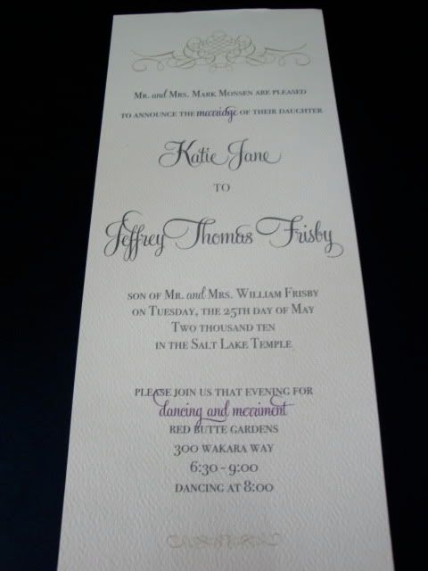 We did a tea length invite on what I refer to as 'watercolor' paper. We didn't want everything thrown into the envelope all loosey goosey, so we made a band that held everything in it's place...and I love that band. Her colors were green & purple & I love that they dressed to coordinate in their engagement pictures...it's all in the details!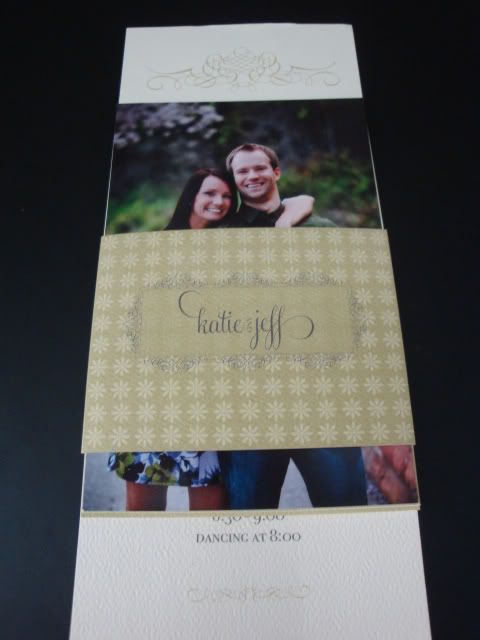
Simplicity.
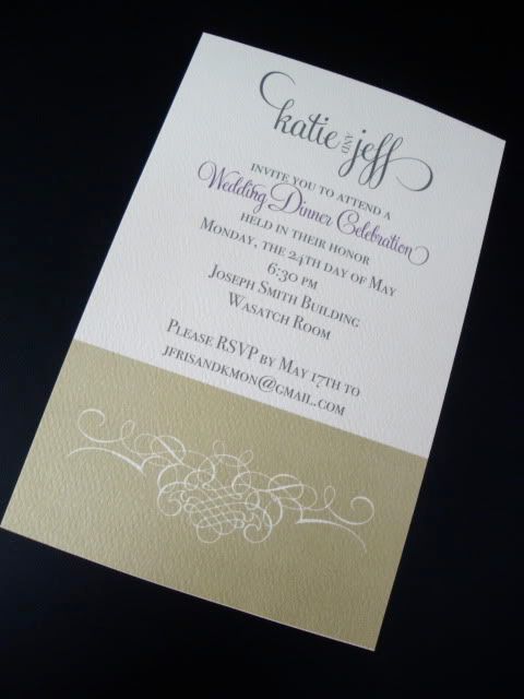 We carried the 'katie & jeff' logo over into their inserts for the wedding dinner & temple ceremony.
One of my favorite things one these invites was the envelopes. They were actually the starting point for me creatively. The were green & tea length, but opposed to having the flap go across horizontally, it went vertically. So cute. I had also seen the idea of cute labels & so we incorporated that as well.
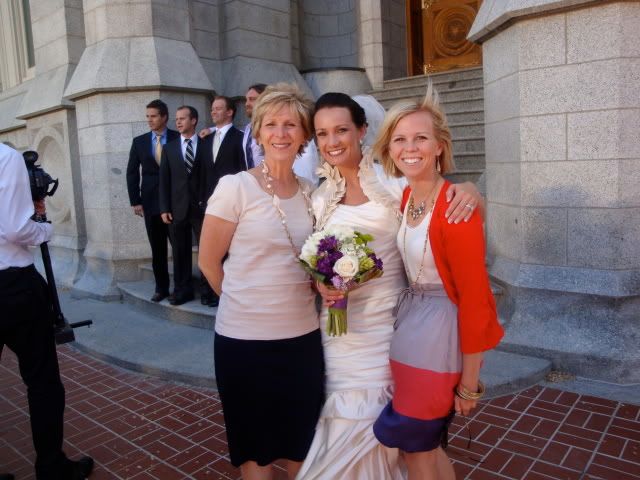 And here I am. At the wedding. With the bride. My mom & my short hair {boo}.
Congrats to Katie & Jeff...they are honeymooning in St. Lucia. Sounds lovely, right?
Subscribe to:
Posts (Atom)
Popular Posts
-
If you're like me, you've mailed your cards, your inches away from being completely DONE on Christmas shopping & maybe yo...
-
 With Mother's Day just around the corner I thought I'd share my Mother's Day cards for this year. Mother's Day always seems...
 -
 Whether you admit it or not, we all know that the cheapest, most bang for you buck place to print your photos & printables is Cos...
 -
I know. I know...there is Thanksgiving in between. And while we are focusing on Thanksgiving for 25 days, Christmas is lingering there in t...
-
 Have you met my sister? If not, let me tell you that she is the party planning extraordinaire. Really. And sometimes I am right there wi...


LinkWithin
