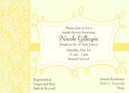
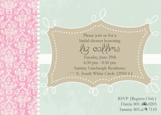
 the above layout is one i have used several times for different occasions. for whatever reason i like it. feminine & slightly weathered. what can i say, it works for me. for this particular client, she was using it for a bridal shower. and she wanted this layout, with this color scheme.
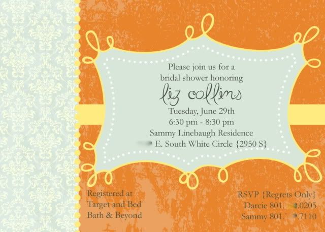 and this is what the mix produced. she wasn't sure about the colors after we got it laid out so we tried a few more. and by a few i mean a lot more. scroll through and pick your fave. i know mine.
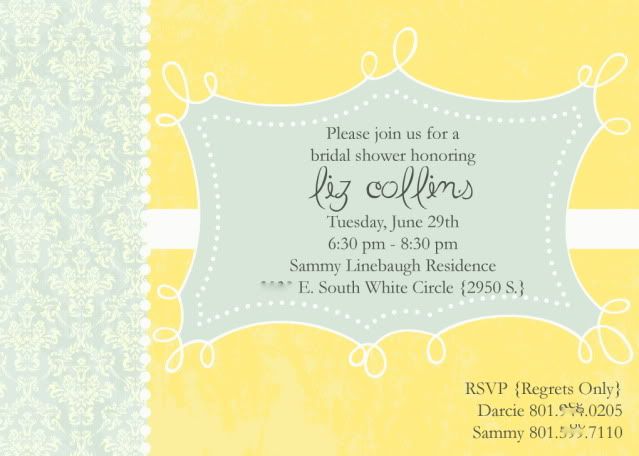 first we went to yellows & blues. that was a no.
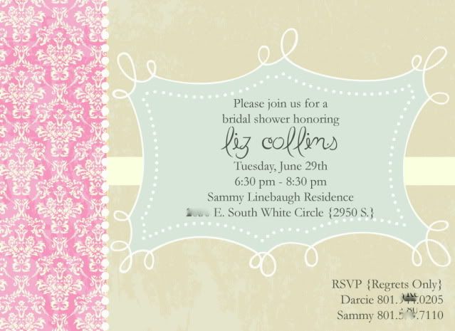 then we did pinks, blues & grays. still a no both ways.
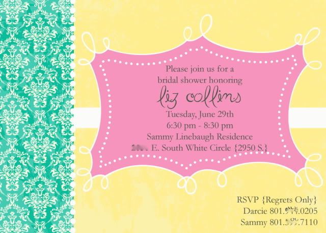 then we amped up the colors for more vibrancy. still a no. which i have to agree. so not my fave.
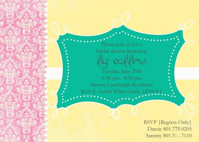 and in the end, i think we went back to the original. which is usually what happens.
which one is your fave?
mine is the pinks, blues & grays, which i promptly used for my mother-in-laws 50th bday bash.
remixing. it's a good thing.


1 comment:
I like the orange. But maybe because orange is Halloween...and I love Halloween. It is so close! Super cute cards.
Post a Comment